Are you more likely to buy from a brand you recognise? Most of us are.
Heinz, Fairy, and Cadbury are examples of household names you probably wouldn’t hesitate buying. When you think of red and yellow branding does your mind automatically think of McDonald’s?
It goes without saying that branding is key with 50% of people saying they would pay more to buy from a brand they know and trust. So what if a company needs to rebrand?
What is rebranding?
Rebranding is the process of switching up a brand with the aim of developing a new image and identity with consumers. Typically a rebrand involves coming up with a new brand name, logo, term, design, or concept.
A rebrand can make or break a brand, there’s no doubt about it. An effective rebrand can lead to great success, boosting revenue and brand awareness. Without a strategy, extensive planning, and an understanding of the desired target audience a rebrand can lead to –
- Negative criticism
- Loss of consumers
- Confusion and distrust
Why do companies choose to rebrand if this comes with so many risks? Like any risk in marketing, rebranding can come with a whole host of benefits like –
- Connect with a new audience
- Reposition brand image and reputation
- Boost brand awareness and recognition
- Drive sales and increase revenue
But what is the purpose of a rebrand?
What is the purpose of rebranding?
A brand’s relationship with its audience isn’t stagnant, over time it shifts and changes. To stay present and relevant in the fast-paced world we live in, a brand must continue to evolve. An outdated logo, off-key tone of voice, or disconnected target audience can be examples of signs that a brand needs something new and may need to make a comeback.
A rebrand is a marketing strategy that, when done right, can breathe new life into a brand. Often the purpose of rebranding is to –
- Create a new look and feel for a brand
- Reposition a brand to a new or existing customer base
- Broaden brand appeal and reach a wider audience
- Expand into a new market
- Overcome negative reputation
- Drive growth
Rebranding is a big decision that shouldn’t be taken lightly. It’s a delicate process that requires extensive research, careful planning, and a tactical execution.
Are you thinking about rebranding and looking for some inspiration? Maybe you’re just curious and want to know more about this marketing strategy. Either way, we’ve got you! There’s been lots of rebrands in recent years so let’s take a look at some of the best and the worst.
Best rebrands
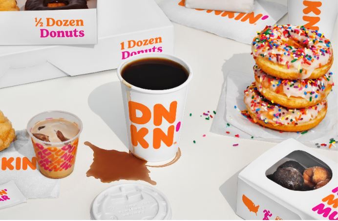
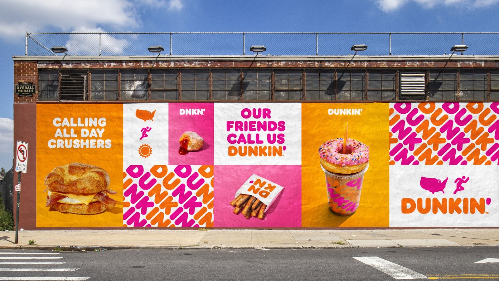
Dunkin’
Dunkin’ began their slow and steady rebrand in January 2019.
Known for their delicious doughnuts, Dunkin’ wanted to reposition itself as a beverage led company to attract consumers who didn’t realise they had so much more on offer.
Capitalising on coffee, the brand focused on messaging and animation but kept their colour palette and typography the same – so the infamous brand was still easy to recognise.
Dunkin’s change in name was far from drastic, but aligned with their existing slogan America runs on Dunkin’. For consumers, many of whom already referred to the brand by its new name, the rebrand made sense as the brand identity remained much the same. Dunkin’ recognised it had to adapt to stay relevant and meet the needs of consumers. Its rebrand was a success with 32% of people drawn to their new logo and a peak revenue of $1.4 billion in 2019.
Burberry
In 2009, British fashion house Burberry was struggling.
An influx of fake products led Burberry to be associated with British subculture, a far cry from their desirable audience who they were unable to reach. Keen to rid themselves of this negative image, Burberry went back to the drawing board and came up with an exciting campaign.
After catapulting to fame in the Harry Potter film franchise, Emma Watson was Britain’s new it-girl and named the face of Burberry’s 2009 fall campaign.
A tactical decision, Emma’s starring role modernised the brand and captured the attention of younger audiences. Whilst the campaign, shot in Westminster to represent Burberry’s rich history, emulated understated beauty and featured a handful of their timeless key pieces.
Although this isn’t a full rebrand, Burberry is a great example of a brand that can successfully reposition itself.

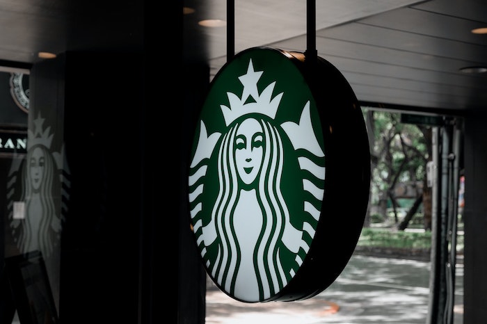
Starbucks
Do you remember the Starbucks original logo?
40 years after its story began, the coffee house decided it needed a refresh in order to attract a wider audience.
Starbucks was built on coffee and creating a space for those who loved it, but they wanted to offer more. To symbolise a fresh start the brand redesigned its logo, removing the wordmark ‘Starbucks Coffee’. The siren, a longstanding part of Starbucks brand identity, was now the focal point against a deep green background.
These changes were simple yet effective and representative of the fact the brand no longer only sold coffee. Expanding their product line to include food, new drinks, and a membership was a part of Starbucks rebranding. This innovation made Starbucks a brand for everyone and led to a record revenue of $11.7 billion in 2011, an 11% increase on the previous year.
Worst rebrands
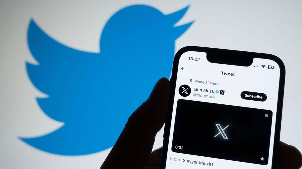
Earlier this year, after acquiring Twitter in October 2022, Elon Musk announced that the popular social media platform would be rebranding to X
This change was huge, abrupt, and hasn’t stuck with 72% of people still referring to X as Twitter. Why? Elon’s new venture isn’t new or different, besides a handful of features X and Twitter are practically the same and operate in the same space. The decision has left loyal users (and the rest of us) asking why, with no apparent reason for the brand other than Elon’s fondness for the letter X.
So far the rebrand has proven unsuccessful, since Elon’s takeover the platform has lost 13% of its daily active users.
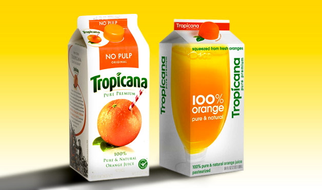
Tropicana
Worldwide famous fruit juice brand Tropicana is known for its bright, bold packaging. Their best-selling product, Tropicana Pure Premium, is a staple in many households and rakes in a whopping $700 million per year.
Back in 2008, Tropicana launched its new product packaging replacing the popular orange with a straw to a glass of orange juice. By doing so Tropicana removed the distinguishing features from their packaging and made the product unidentifiable for loyal consumers. The star product lost its premium feel and became a generic supermarket product.
A brand’s visual identity is key in resonating with consumers, Tropicana’s decision failed to consider audience opinion and preference. A 20% fall in sales and a loss of $30 million forced Tropicana to return to its original design just two months later.
Acknowledging the return to Tropicana’s original design Neil Campbell, President at Tropicana North America, stated…
“We underestimated the deep emotional bond they had with the original packaging” […]“What we didn’t get was the passion this very loyal small group of consumers have. That wasn’t something that came out in the research. […] Those consumers are very important to us, so we responded.”
Tropicana’s rebrand didn’t go to plan and they bounced back. This shows us that rebrands can go wrong, but can be rectified too.
Gap
For decades, Gap was a beloved retailer and emblematic of American style.
Favoured for its relaxed basics and structured denim, in the 1990s and early 2000s you couldn’t walk down the street without seeing Gap’s classic logo hoodie.
The financial crash of 2008 left Gap in decline. In a bid to increase sales and modernise the brand, Gap sought action in the form of a rebrand. Without warning, Gap relaunched during the Christmas season of 2010. But the extent of Gap’s relaunch was a new logo, it wasn’t accompanied by a new product line or mission statement.
The poorly executed rebrand quickly received negative feedback from customers and designers, who felt Gap had chosen to abandon its history and visual identity.
Just one week after relaunch, Gap returned to its original logo stating that they had handled rebranding in the wrong way and should’ve involved customers in their big decision.
What can we learn from these rebrands?
Executing the perfect rebrand isn’t going to be easy, even big budget brands get it wrong sometimes! But what can we learn from these best and worst rebrands?
- Brand identity is EVERYTHING
- Make sure your brand is still recognisable
- Ensure you know and understand what your audience wants
- Don’t rebrand overnight
- Your rebrand should have a purpose
There are tons of marketing strategies and tactics out there, there’s lots to learn and that’s why we’re here to help. Join the Girls in Marketing membership to gain access to exclusive webinars, resources and courses designed by marketing experts, as well as a wonderful community of women.
As marketers staying inspired is pivotal and, as we look ahead to 2024, we want to celebrate the women shaping the marketing landscape. Each year we spotlight women to follow with our list and this year is no different. But we’re mixing it because we want you to get involved!
Fancy a spot on the list or maybe you know someone who deserves one? You can nominate yourself or someone else to feature on our list by filling in the form here.